How Designers Actually Train Their Eye
Design taste is trainable. Here is a six-step way to break down work you admire, a daily 40-minute routine, and an 8-week plan to fix your weakest skill.
🎯 Taste is not knowing what looks good. It is being able to spot small differences, explain why a design works, and rebuild that quality in your own files. The training is concrete too: take one piece apart every day, measure it, copy the skeleton, build variations, then force yourself to justify your choice.
Most designers get stuck in the same place. You have scrolled through Behance, saved a few thousand images on Pinterest, and check Awwwards daily. You can look at someone else’s work and say “that looks good.” Then you open your own file and end up with the same oversized heading, gradient, rounded card, drop shadow, and glass effect.
The reason is simple: you have been training how much design you have seen, not why it was designed that way.
Once your eye improves, your reaction to the same page changes:
| Stage | What goes through your head |
|---|---|
| Beginner | This page looks great. |
| Intermediate | The product is the first thing you see, the headline carries the second layer, the text column is deliberately narrow, there is almost no decorative color, and the image takes up about 60 percent, so the page feels quiet. |
| Advanced | A larger headline would compete with the product. A brand-colored button would make the CTA more obvious, but it would break the calm. |
Once you can think like that third row, you have moved from liking design to judging design.
Taste is trainable, and what you train is visual resolution
You can be trained to notice smaller visual differences
Perception research has a name for this: visual perceptual learning. With sustained practice, people get better at noticing visual differences and patterns they used to miss.
It still happens in adults. Studies show training can improve everything from simple feature discrimination to complex scene analysis, and one clear difference between experts and novices is that experts find the useful information faster and ignore the rest. (PubMed Central (PMC))
Beginners and experienced designers are not looking at the same page
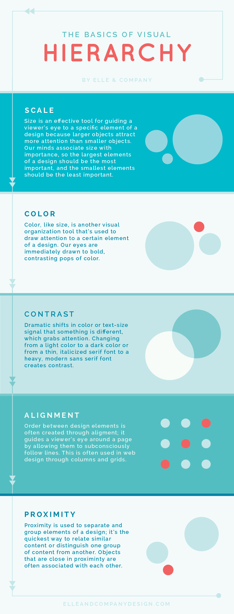
Show two beginners two versions of a landing page and you usually get one sentence:
A looks better.
Someone with a few years of practice sees a different set of facts:
In A the headline, body copy, and CTA sit in three clear levels.
The left and right margins match.
Image and text hold a stable ratio.
The text lines are not too long.
The accent color appears only where attention is needed.
When you see more, your judgment gets more accurate. So the core of training taste is simple: keep raising your own visual resolution.
Why browsing design galleries barely counts as practice
Effective practice needs a goal, a weakness, and feedback
Looking at good work helps, but repetition alone is not practice. Summarizing the research on deliberate practice, the American Psychological Association stresses that effective practice needs a specific goal, work aimed at weaknesses, repetition, and feedback. Repeating what you can already do produces very little improvement. (American Psychological Association)
Experts practice their weak areas, average performers practice their strong ones
In one study, people at different skill levels chose their own practice material. The stronger performers were more likely to work on the tasks they were weakest at, while average performers preferred what they were already good at. The experts also improved more consistently on their weak areas. (American Psychological Association)
Design works the same way. You enjoy color, so you save color palettes every day. Your layout is weak, and you never practice layout. Six months later the collection is bigger and the work has not changed.
⚠️ The three most common forms of fake practice: scrolling inspiration sites with no goal, saving work without taking it apart, and only practicing what you are already good at. None of them sharpen your judgment.
Treat training as a loop
Real practice runs as a chain:
Look → break down → copy → modify → critique → make something.
Skip the last four steps and the first two are mostly wasted.
Decide which skill you are actually practicing
“Taste” is too broad. In practice it breaks down into specific skills. Find your weakest one or two, then decide what to train.
| Skill | What to look at | Common beginner problem |
|---|---|---|
| Visual hierarchy | What you see first, second, and third | Everything fights to stand out |
| Layout | Grid, margins, alignment, proportion | Elements look randomly placed |
| White space | Why the gaps are that size | Fear of emptiness, so everything gets filled |
| Type | Typeface, size, weight, line height, line length | Too many typefaces, unclear levels |
| Color | Primary, secondary, background, accent | Color everywhere |
| Imagery | Crop, ratio, composition, tone | Any “close enough” photo will do |
| Rhythm | Scale, density, repetition, variation | Every section looks identical |
| Style | Which elements create the feeling | Only knows how to copy “premium” |
| Information design | What the user learns first, then next | Pretty page nobody understands |
Take type as an example. Apple’s design guidance points out that you can build hierarchy with size, weight, and color, and that using too many typefaces weakens both hierarchy and consistency. (Apple Developer)
So when you see a page you like, do not stop at “what typeface is this?” Keep going:
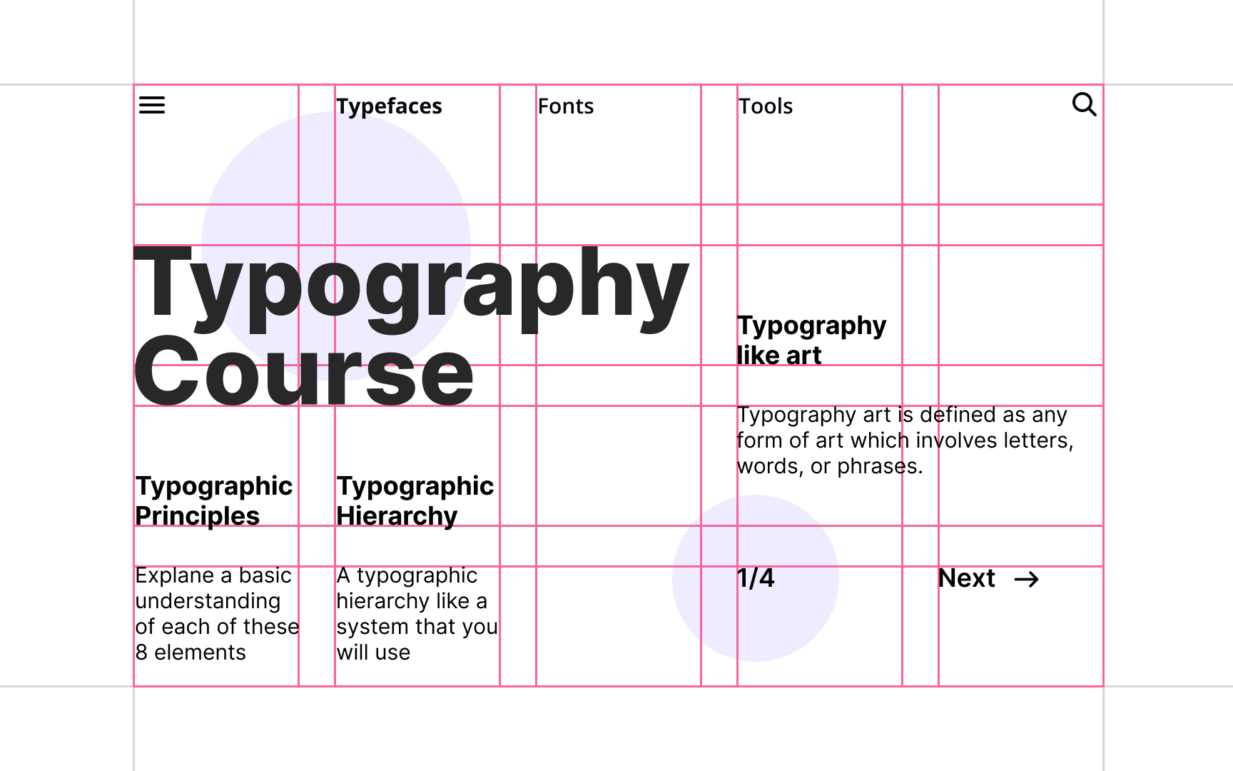
How big is the H1? The body text? What is the gap between them?
What is the line height? How much space sits between heading and paragraph?
Why is this line bold?
Answers you can measure are the only ones you can take with you.
The core method: six steps to take a design apart
Run all six steps every time you find work you admire.
1. Look for ten seconds without analyzing
Record your first reaction, then immediately write down: what did you see first, second, and third?
For example:
First: the shoe
Second: AIR MAX
Third: Buy Now
That is the page’s visual order. If you cannot describe it at all, the hierarchy itself is unclear.
2. Reduce the page to a few blocks
Ignore the logo, the copy, and what is in the photos. Look only at shapes: a large rectangle here, a block of text there, an image, a wide area of empty space.
Do this and you will notice that most “premium” work has a very simple structure. The hard part is proportion.
3. Measure it in Figma
Stop guessing. Measure the page width, the left and right margins, the number of grid columns, how much of the page the image occupies, the heading size, and the spacing between sections.
After you have measured a few dozen good examples, you develop a sense of the normal range, which gives you something to work against in your own files.
4. Rebuild the skeleton before you touch color
This is the step most people avoid and the one that works best. You do not need a full replica. The first pass can be nothing but gray boxes that match size, proportion, alignment, spacing, and type scale. Once the skeleton is right, add color and typefaces.
5. Build three variations
Do not stop at the copy. If the original is “text left, product right,” make three more:
Version A: image at 50 percent
Version B: image at 70 percent
Version C: full-bleed image
Then compare them side by side. Looking at a single option, you can rarely say what makes it good. Taste tends to grow out of comparison.
6. Force yourself to explain the choice
Finish by asking why one version wins. “More premium,” “more comfortable,” and “better design sense” are banned answers. Be specific about elements:
B is better because the larger image makes the product the first focal point. The headline drops to the second level, but the CTA is still easy to find.
Stanford d.school makes the same point about design critique: feedback should come back to the goal of the work — which design elements serve that goal, and whether they actually achieve it. (Stanford d.school)
This step trains a skill that matters more than it sounds: being able to defend your own decisions.
How to spend 40 to 60 minutes a day
You do not need two hours. Forty to sixty minutes a day for two months beats a five-hour weekend scroll through Behance.
| Time | What you do |
|---|---|
| 10 min | Look at 10 pieces, pick 1 |
| 10 min | Analyze hierarchy, layout, type, color |
| 20 min | Rebuild the skeleton in Figma |
| 10 min | Make one variation of your own |
| 5 min | Write down 3 observations |
Those three notes should be reusable, for example:
Large images do not create clutter as long as the text area stays restrained.
Hierarchy between heading and body usually comes from size, not a second typeface.
The more space around a CTA, the easier it is to notice.
💡 Three notes a day is roughly 90 judgment rules a month that are genuinely yours. That is worth far more than 900 saved images.
Give each design site a specific job
Stop treating every site as an inspiration feed. Each one should train something different.
| Site | What to train | How to use it |
|---|---|---|
| SiteInspire | Web layout | Filter by Grid, Typography, Minimal for focused study |
| Mobbin | UI and product design | See how real apps handle login, checkout, settings |
| Awwwards | Experimental web and motion | Study bold ideas, copy them rarely |
| Fonts In Use | Type | See typefaces used in real projects |
| Typewolf | Web typography | Study pairings and web font choices |
| Brand New | Brand judgment | Read why people praise or criticize an identity |
| Cosmos | Building a visual library | Pull references across photography, architecture, graphics, fashion |
SiteInspire lets you filter by styles such as Typographic, Minimal, and Grid Layout, which makes it useful for layout drills. (Siteinspire) Mobbin collects large numbers of real product screens and user flows rather than concept work made for portfolios, so it suits product design practice. (Mobbin) Fonts In Use documents typefaces in shipped projects, which teaches more than staring at specimen sheets. (fontsinuse.com)
Brand New serves a slightly different purpose: it reviews logos, identities, and redesigns, so the value is in how it argues, not only in the cases themselves. (UnderConsideration) Cosmos lets you keep exploring by color and visual similarity and organize what you find into collections, which suits a long-term reference library. (Cosmos)
Build your own reference library around design reasons
The least useful library looks like this: nice UI, nice posters, nice websites, premium. Sort work that way and you will never find anything again.
Sort by the design reason instead:
| Category | What goes in it |
|---|---|
| Extreme white space | Work that holds up with large empty areas |
| Type-driven | Typography carries the visual weight |
| Single accent color | Only one accent color in the whole design |
| Image-led | Imagery covers more than 50 percent |
| Asymmetric grid | Clearly off-balance but still stable |
| Dense data | Lots of information without visual noise |
| Strong first focal point | Attention is unambiguous within 3 seconds |
| Restrained CTA | The button is quiet but easy to find |
| Strong product photography | Cases with unusually good product shots |
Every time you save something, add one line about why you saved it, such as “like the 7:3 ratio between product and text in the hero” or “like the contrast between a serif headline and sans-serif body.” Later you can search for “7:3 hero” instead of aimlessly searching for “premium web design.”
The two easiest traps: color and “premium” styling
Work in grayscale first, then add color
The fastest quality gain for beginners is blunt: take the color out. If the hierarchy is clear, the layout is comfortable, and the content reads well in grayscale, then start adding color.
Apple’s guidance also recommends using color sparingly, giving it a clear job such as information, state, or brand, and keeping its meaning consistent. (Apple Developer)
Looking good cannot cost you legibility
WCAG 2.2 recommends a contrast ratio of at least 4.5:1 for normal text and 3:1 for large text. (W3C)
So light gray text on a light gray background may feel refined, but if users cannot read it, it is bad design.
”Premium” is not a universal answer
A premium look often collapses into one fixed recipe: lots of white space, small type, a serif, off-white, black, big images, slow animation. The result is a wave of sites that look identical.
A more mature question comes first: does this design fit the problem it has to solve? A kids’ product can be loud. A game site can be extravagant. An industrial equipment site needs clarity. A luxury brand can afford acres of white space. A data dashboard cannot hide information for the sake of it.
Beauty makes people misjudge usability
NN/g describes this as the aesthetic-usability effect: users often perceive attractive products as more usable, and may even overlook real usability problems for a while. (Nielsen Norman Group)
The sentence designers need to guard against is the reverse: “it looks good, so it must be well designed.” Not necessarily.
Use a scorecard to find your weak spot, then fix it by the week
Score every piece you finish
“Does it look good?” is too vague. Score it item by item instead:
| Item | Question | 1–5 |
|---|---|---|
| First focal point | Do you know where to look immediately | |
| Hierarchy | Is relative importance obvious at a glance | |
| Alignment | Any unexplained offsets | |
| White space | Which areas are too tight or too empty | |
| Typography | Are size, weight, and line height consistent | |
| Color | Does every color have a clear job | |
| Imagery | Are crop, ratio, and tone appropriate | |
| Consistency | Do similar elements follow the same rules | |
| Function | Does the user know the next step | |
| Character | Is there one genuinely memorable detail |
Find the lowest score and make it the focus of your next practice session.
An eight-week sequence
| Week | Focus | Assignment |
|---|---|---|
| Week 1 | Visual hierarchy | Break down 3 pages a day |
| Week 2 | Grid and white space | Rebuild 5 page skeletons |
| Week 3 | Typography | Rebuild 10 type layouts |
| Week 4 | Color | Give one page 5 different color schemes |
| Week 5 | Imagery | Study crop, scale, placement |
| Week 6 | UI patterns | Break down 5 real flows in Mobbin |
| Week 7 | Style | Design the same content in 3 very different styles |
| Week 8 | Full project | Ship one complete site or identity on your own |
✅ Do not chase originality in the first four weeks. Get proportion, hierarchy, alignment, type, and color stable. When work feels slightly off, the missing piece is usually fundamentals, not ideas.
How to tell your eye has improved
The change shows up in how you talk about design:
| Stage | What you say |
|---|---|
| Beginner | Nice. |
| Improving | Nice, because… |
| Further along | Nice, but this part has a problem. |
| Advanced | This version is less striking than the other one, but it fits the project better. |
Once you can say that last sentence, you have your own standard.
Taste is not knowing what looks good. It is noticing small differences, explaining why they work, and rebuilding them in your own work. So stop asking how much good design you should look at today, and ask instead: which design am I going to actually understand today? Understand one a day and that is more than three hundred a year, which is enough to move anyone’s judgment a long way forward.