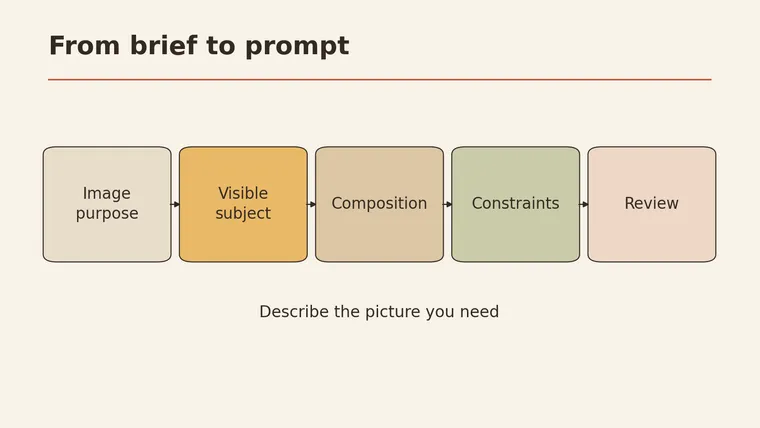
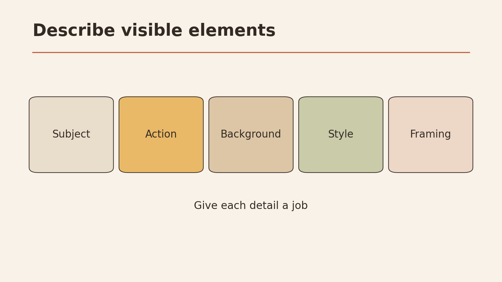
This AI image prompts guide starts from one idea: describe the picture someone needs to see, in plain words, beginning with the job the image has to do. The essentials come down to a short list: the subject, what it is doing, the setting or background, the framing, the style, and the colors and mood. Meta’s own prompting guide groups image descriptions around those same elements (Meta AI). Add only details that serve the image’s purpose, and name anything that must appear. Then check the result against that purpose. Looking pretty is a bonus. If it misses, change one part of the prompt at a time so you can tell what made the difference.
Below you’ll find a goal-to-visual table, a reusable template, three fully explained example prompts, an iteration log, and a short section on what reference images can and can’t tell you.
Start with the job the image must do
Most weak image prompts start with a style (“a beautiful cinematic image of…”). Better prompts start with the reason the image exists.
Ask yourself: What should a reader understand or feel after one glance? An image at the top of a how-to article has a different job from a product shot or a diagram-like illustration. Once you know the job, you can work out what has to be visible.
The table below, designed for this article, turns common goals into visible elements you can actually write into a prompt.
| What the reader should get | What must be visible | Example phrase for the prompt |
|---|---|---|
| ”This is about saving time” | A person finishing a task quickly, a clock or calendar in view | ”a person closing a laptop with a relieved smile, a wall clock showing early afternoon" |
| "These two options are different” | Two clearly separated objects or areas, side by side | ”split composition, left side shows…, right side shows…" |
| "This is a step-by-step process” | Objects arranged in a clear sequence | ”three objects in a row from left to right, each slightly larger" |
| "This product is easy to hold” | A hand holding it, scale clear | ”a hand holding a small speaker, close-up, neutral background" |
| "This topic feels calm and unhurried” | Soft light, open space, few objects | ”soft morning light, lots of empty space, muted colors" |
| "This is about a specific place” | A recognizable setting in the background | ”a small kitchen with a window over the sink” |
If you can’t fill in the middle column, the image’s job probably isn’t clear yet. Decide that first.
Subject
The subject is who or what the image is about. Make it specific enough that someone could sketch it from your words.
- Vague: “a person working”
- Clear: “a middle-aged woman in a gray sweater typing on a laptop at a wooden desk”
Luma’s prompting guide makes the same point: a clear subject and scene, with details that have a purpose, give the model something concrete to work with (Luma AI).
Add the action right after the subject. What is the subject doing? “Typing,” “holding a mug,” “pointing at a whiteboard.” An action gives the image life and often carries the message better than a style word does.
Keep to one main subject when you can. Every extra person or object is another thing that can come out wrong.
Composition and background
Composition is how things are arranged in the frame. Background is what sits behind the subject. Both shape what the eye notices first.
Framing words that help:
- Close-up: face, hands, or a single object fills the frame
- Medium shot: a person from the waist up
- Wide shot: the whole scene, the subject smaller within it
- Top-down / overhead: looking straight down at a table or surface
- Centered / off to the left / off to the right: where the subject sits
Background choices:
- Plain or neutral background: keeps attention on the subject, useful for product or concept images
- Simple setting: a desk, a kitchen, a park bench; enough context to tell a story
- Busy setting: only when the setting is the point
If the image will have a headline or text placed over it later, say so in the composition: “subject on the right third, open space on the left.” That’s a practical detail with a clear purpose.
Style
Style is how the image looks: photo, flat illustration, watercolor, 3D render, line drawing. It also covers color and mood, which Meta’s guide lists as separate elements worth describing (Meta AI).
Pick style for the job first, then for taste:
| Image job | Style that often fits | Why |
|---|---|---|
| Explain a concept | Flat illustration, simple shapes | Fewer distracting details |
| Show a real-world situation | Natural-looking photo style | Feels familiar and concrete |
| Compare two things | Clean illustration, two-color palette | Contrast is easy to read |
| Set a warm, personal tone | Soft watercolor or hand-drawn look | Feels human and relaxed |
Be careful with stacks of style words like “ultra-detailed, award-winning, 8K, masterpiece.” They don’t describe anything a reader will see, and they crowd out the details that do.
A reusable prompt template
This template was designed for this article. It follows the element order above. Fill in each line, then join them into a paragraph.
IMAGE PROMPT TEMPLATE

Job of the image: (what the reader should get in one glance)
Subject: (who/what, specific enough to sketch)
Action: (what the subject is doing)
Setting / background: (where; plain, simple, or detailed)
Framing: (close-up / medium / wide / overhead; subject position)
Style: (photo / flat illustration / watercolor / line drawing...)
Color and mood: (palette; calm, busy, warm, serious...)
Must include: (objects or details that cannot be missing)
Must avoid: (things that would confuse the message)
Space for text? (yes - where / no)
Leave “Job of the image” out of the final prompt if your tool doesn’t need it. It’s there to keep you honest while you write the other lines.
Three example prompts, explained
These three prompts were written for this article as input examples. They have not been generated or tested here, and no result is promised. Their purpose is to show which information earns its place.
Example 1: hero image for an article about cutting meeting time
A young man in a blue shirt walks out of a small meeting room holding a coffee cup, smiling. Behind him, through a glass wall, an empty table with a closed laptop. Medium shot, subject on the right third of the frame, open wall space on the left. Natural-looking photo style, soft daylight, calm and light mood, muted blue and white colors.
Why each part is there:
- “walks out of a meeting room… smiling”: the action carries the message: the meeting is over, and that’s good.
- “empty table with a closed laptop”: background confirms the meeting has ended.
- “subject on the right third… open wall space on the left”: leaves room for a headline.
- “calm and light mood, muted colors”: matches a practical, low-stress topic.
Example 2: comparison image for “paper notes vs digital notes”
Split composition. Left half: a hand writing in a spiral notebook with a pencil on a wooden desk. Right half: the same hand typing on a tablet on the same desk. Overhead view, both halves evenly lit. Flat illustration style, simple shapes, warm yellow on the left, cool blue on the right.
Why each part is there:
- “split composition… left half… right half”: the job is comparison, so the layout says so.
- “the same hand… the same desk”: keeps everything else equal so only the tool changes.
- “overhead view”: shows both objects clearly without perspective tricks.
- “warm yellow… cool blue”: color helps the reader tell the halves apart at a glance.
Example 3: product-style image for a small kitchen timer
A round white kitchen timer sits on a light gray countertop, a hand reaching in from the right to turn the dial. Close-up, timer centered, plain background with a soft shadow. Clean photo style, bright even light, neutral colors. Must include: the dial with visible tick marks. Avoid: text or brand logos on the timer.
Why each part is there:
- “a hand… to turn the dial”: shows how it’s used and gives a sense of size.
- “plain background with a soft shadow”: keeps focus on the object.
- “Must include: the dial with visible tick marks”: the one detail a buyer needs to see.
- “Avoid: text or brand logos”: prevents invented labels that could mislead.
For help phrasing requests to AI more generally, see how to ask better AI questions. You can also browse ready-to-adapt prompts on the YepSoso prompts page.
Iteration
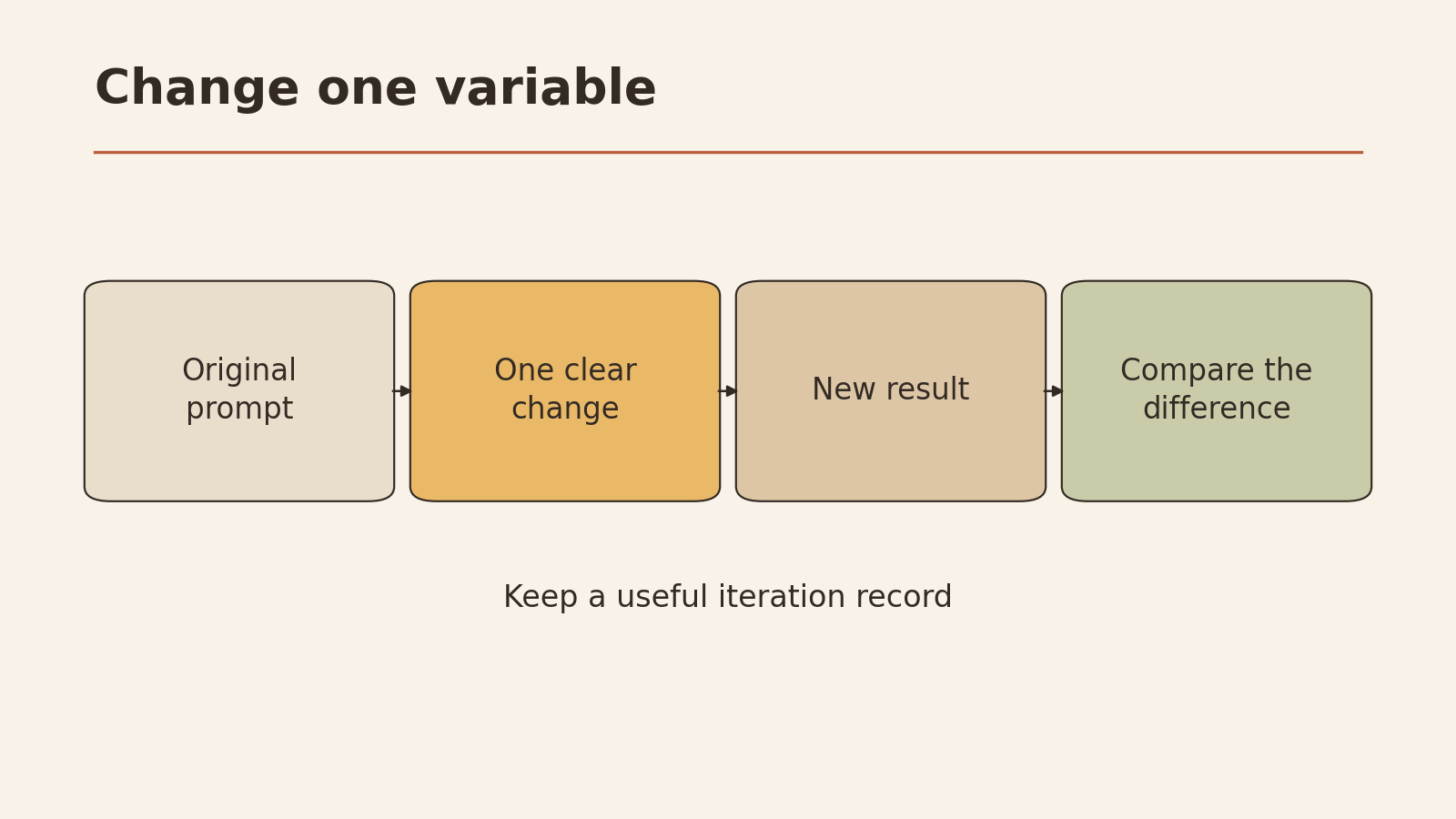
The first result rarely fits perfectly. Iteration works best when you decide exactly which part to change, as Luma’s guide also advises (Luma AI). If you rewrite the whole prompt every time, you won’t know what fixed or broke the image.
A simple rule: change one element per round. Move the subject, or change the background, or adjust the style. Not all three.
Iteration log (template)
IMAGE ITERATION LOG

Image job: ____________
Starting prompt (copy in full): ____________

ROUND 1
What's wrong (one thing): ____________
Element I'm changing: Subject / Action / Background /
                      Framing / Style / Color-mood / Must-include
Old wording: ____________
New wording: ____________
Result: better / worse / no change
Keep this change?  Y / N

ROUND 2
What's wrong (one thing): ____________
Element I'm changing: ____________
Old wording: ____________
New wording: ____________
Result: better / worse / no change
Keep this change?  Y / N

Final check against the job:
[ ] A reader gets the message in one glance
[ ] All "must include" items are present and correct
[ ] Nothing in the image is misleading or invented (labels, text, logos)
[ ] Space for text is where I need it (if needed)
[ ] No real person, private detail, or protected design appears by accident
A fictional round-by-round example: In Example 1, suppose the subject ends up in the center, covering the space reserved for the headline. Round 1 changes only the framing line: “subject on the right third” becomes “subject at the far right edge, the left half of the frame empty.” Everything else stays the same. If that works, you keep it. If the mood shifts too, you know the framing change caused it.
What a reference image can and cannot tell you
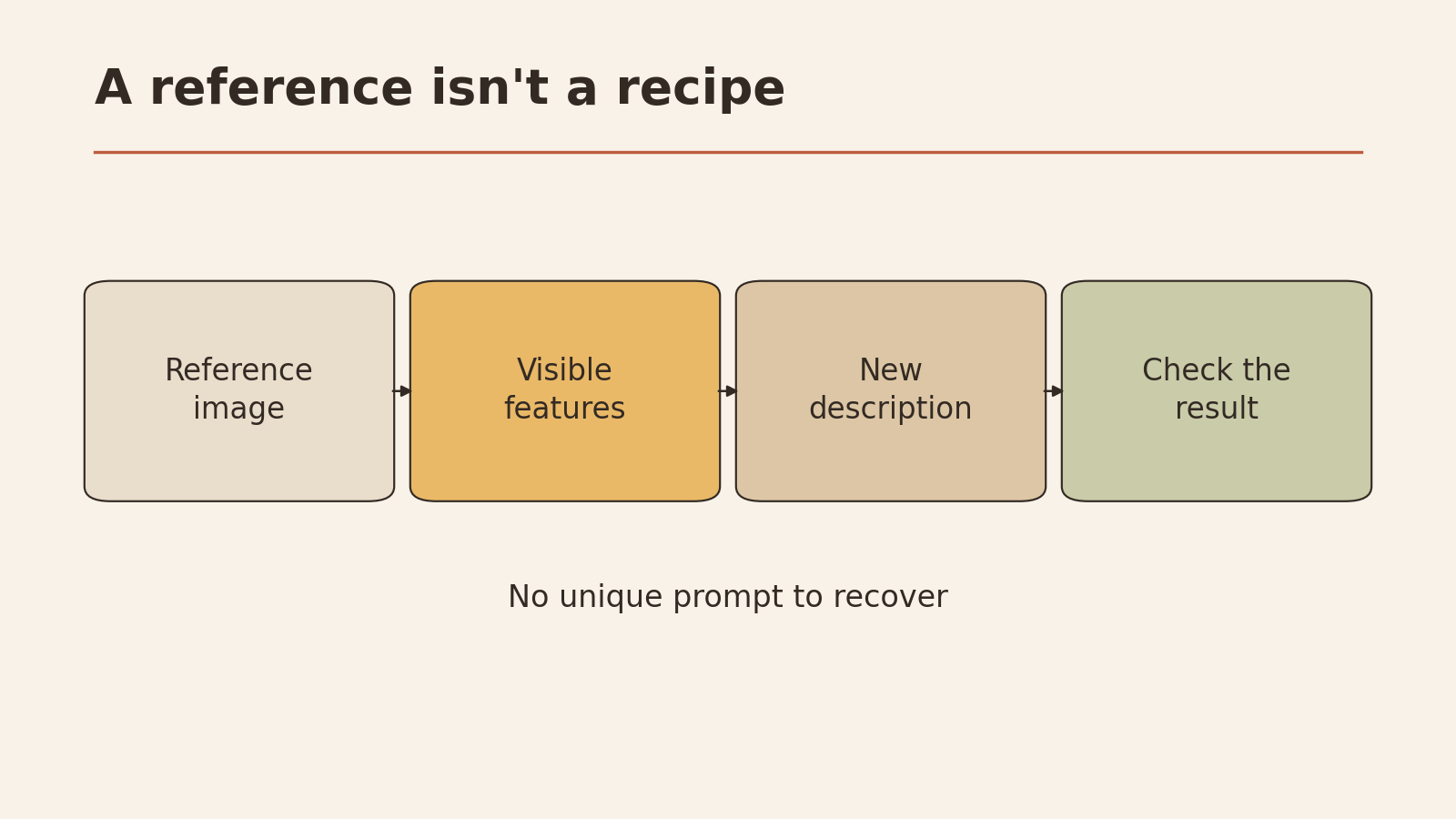
A reference image is a picture you use as inspiration or as an input. It can help, but it has limits.
What it can tell you:
- The kind of framing, colors, or layout you like
- Words to describe a style you couldn’t name before
- A rough target for comparison when you review results
What it cannot tell you:
- The original prompt. Many different prompts can lead to similar-looking images, and the same prompt can produce different images. Describing a picture gives you a prompt, not the prompt.
- Who owns it. A picture found online may be protected. Before uploading it to any tool or copying its look closely, check who made it and what you’re allowed to do with it.
- What’s hidden in it. Photos can contain faces, license plates, addresses, screens, or documents. Crop or remove anything private before using an image as input.
Treat a reference image as a starting point you describe in your own words.
Your checklist before you generate
Copy this list and run through it once per image:
- I can say the image’s job in one sentence
- The subject is specific enough to sketch
- The subject has a clear action
- Setting, framing, and style each serve the job
- “Must include” and “must avoid” are written down
- Text space is planned if needed
- Any reference image is mine to use and has nothing private in it
- I’ll change one element per round and log it
Your next low-risk step: pick one image you need this week, fill in the template, and write a single prompt. Generate it, then review it against the image’s job before you change anything.